Math Arguments
Problems, Questions, and Puzzles to spark discussion and argument in the maths classroom.
Don't Trust the Colorful Map
We often see this map during election season, and people will say "There's so many RED states, look at all the RED. How could the Republican lose?"
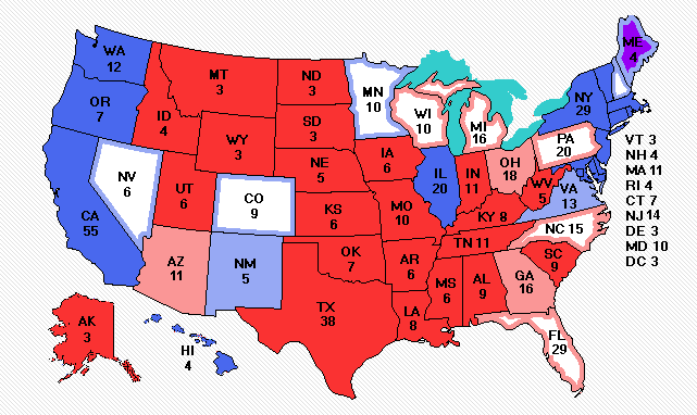
And the answer, of course:
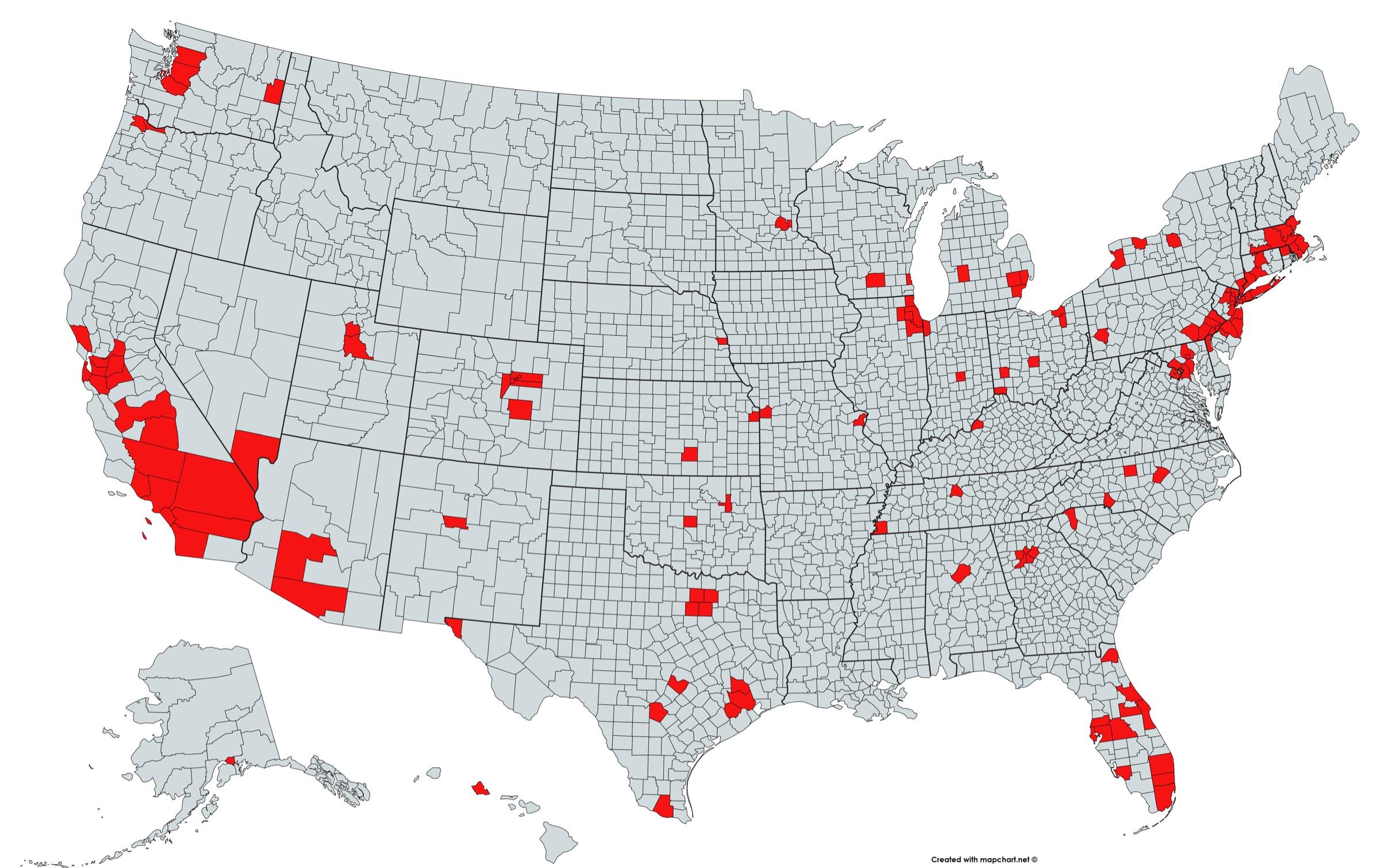
So, what is the reason?
What is this second map showing and why is that so important?
Graphicacy:
Graphicacy is the ability to read or create a visual (usually in graph form); the visual must communicate well with the reader. Generally, if it takes the reader more than a few seconds to figure out what's going on, it's a bad diagram or graph.
INTERPRET THE VISUAL. What is it saying? What point is it trying to make?
Is this visual distorted or misleading? Could quick interpretations of it jump to wrong conclusions? If so, what incorrect conclusions might be drawn? How is it communicating badly: what normal assumptions and expectations does this graph contradict? What errors did the creator make?
Would you change or fix the graph? If so, how would you change it? Do you think this visual was drawn this way on purpose, or is this a mistake or just a matter of incompetence? Is this the best type of graph/visual for this data?
Because dirt doesn't vote; people do. Trees don't have a vote either. One voter in Kansas with 10,000 acres of land shows lots of red but a thousand blue voters in NY barely appears on the map. The meaning of the second chart is that more people live in the red areas than in the gray.
Graphicacy (a variation of the words "Literacy" and "Numeracy") means the ability to read and understand the visual representation of data and ideas. Most commonly, we are interpreting bar charts, pie charts, scatterplots and other data representations, but the rise in the use of infographics has meant that Math teachers must teach this new literacy.
The second aspect of graphicacy is the identification and correction of bad graphics that push a distorted interpretation of the data. Often for political purposes, the promotion of deliberately incorrect or distorted graphs can be damaging to the country, to democracy, or to the health and well-being of the reader. In the words of Mark Twain, "There are three ways to lie. Lies, Damned Lies, and Statistics."
The quintessential Bad Graph: Gun Deaths in Florida
 ++
++