1 of 1 Items .... Source: Kareem Carr
Problems, Questions, and Puzzles to spark discussion and argument in the maths classroom.
Navigation:
- by Course
- by Type
.... - Source: @yohakupuzzle
AFP
Akiyoshi Kitaoka
Aldo Bianchi
Alex Bellos
Alfie Kohn
Amanda Austin
Amie Albrecht
Avery Pickford
Ben Orlin
Benjamin Dickman
Bill Shillito
Bob Lochel
Bowman Dickson
Bryan Anderson
Catriona Agg
Cheesemonkeysf
Chris Lusto
Chris Luzniak
Cliff Pickover
Corbettmaths
Curmudgeon
Dan Anderson
Dan Draper
Dan Meyer
Dan Pearcy
Dave Richeson (@divbyzero
David Butler
David Marain
David Martin
David Wees
DESMOS
Don Steward
Dr. Pickle
Ed Southall
Elemental_41
Emma Bell
Erich Friedman
Fawn Nguyen
Five Triangles
Frank Noschese
Futility Closet
Gabriel Rosenberg
Grabarchuk
Grant Wiggins
Howie Hua
Illustrative Math
internet
James Pearce
James Tanton
Jeff Suzuki
Jennifer Wilson
Jo Morgan (@MathsJem)
Justin Aion
Kareem Carr
Kate Nowak
KHALID
Kiran Bacche
m4ths
Marco
Mary Bourassa
MathCirclesOz
MathedUp!
Mathshell
mathsjem
Matt Enlow
Megan Schmidt
Michael Pershan
Mike Lawler
Mr. Honner
Nathan Day
NCTM
Nob
NRICH
Numberphile
NYTimes
Pam Harris
Patrick Honner
PD
Poor Elijah
Quora
rawrdimus
Rhett Allain
Robert Kaplinsky
Sam Loyd
SAT
SKG
SolveMyMaths
StatSystem
Steve Phelps
Steve Wyborney
Steven Strogatz
Sunil Singh
T.R.Milne
Talking Numbers
Taylor Belcher
TickTockMath
TriangleMan
UKMT
UVM
Vi Hart
XKCD
. . . View This Fullsize
Consider the graph, the creator, the reason for creating it, the data included. What's your reaction?
Continue down to see a screenshot of Elon Musk's response and read the thread from a data scientist. Did you notice what he noticed? Do you agree with him?
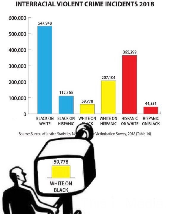
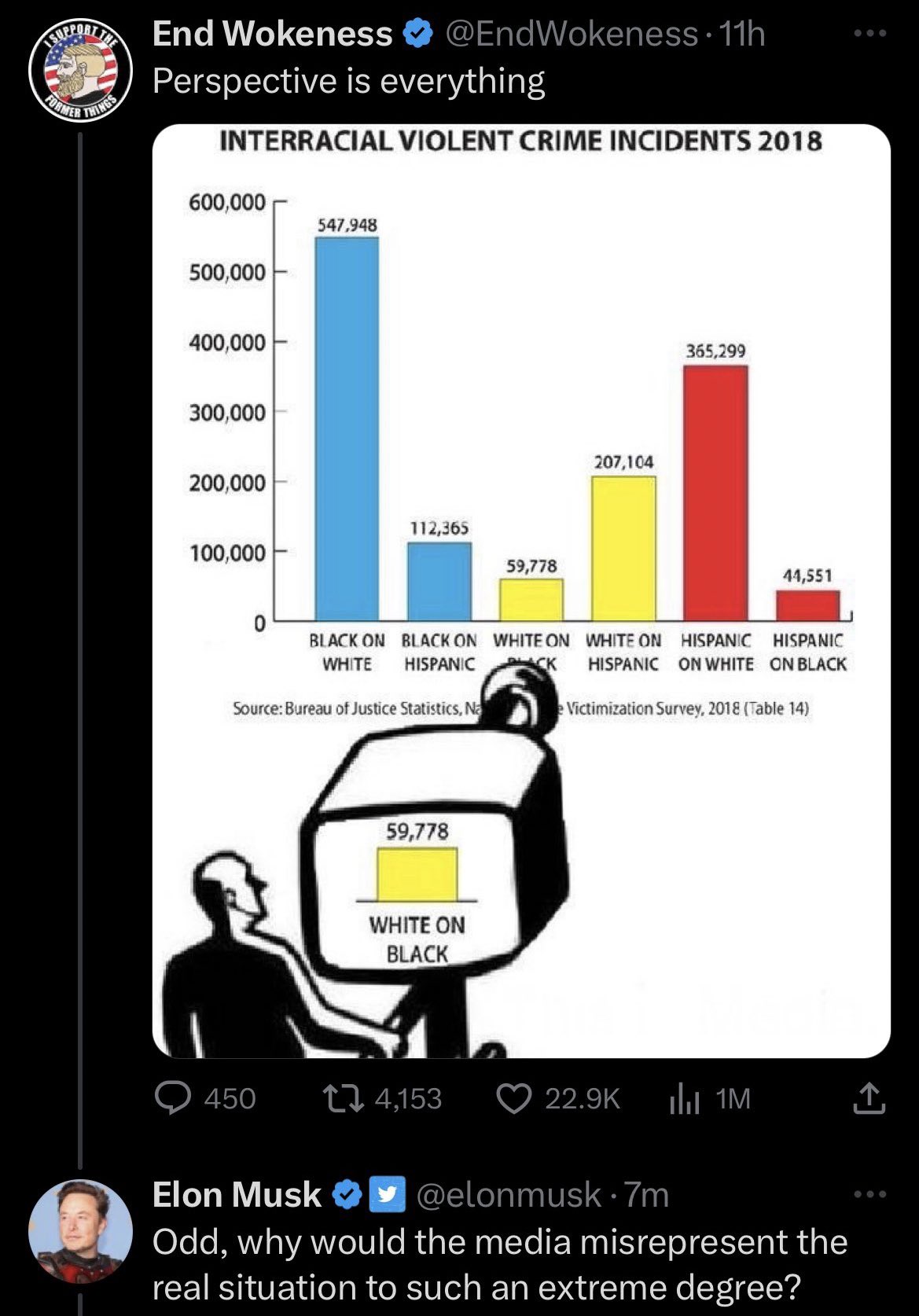
Here is Kareem Carr's (@kareem_carr) response to this graph and Elon Musk's reaction to it.
Carr:
"This bar chart has attracted the attention of the richest man in the world. Let me walk you through how I would interpret it as a statistician (and a human).
I am sure this data is in many ways dubious and the claim that the media exclusively focuses on white-on-black crime is untrue but let’s set that aside for now. I want to talk about the biases in how people present data.
I like to say Statistics is critical thinking with numbers. As a statistician, I want these numbers to help me understand *why* things are happening and what I can do about it.
We want to learn about *causation* not just correlation. For this reason, how we frame the data is extremely important.
Now, I would suspect if the media did disproportionally focus on white-on-black crime, it would be because they have a good faith belief that the causal element in those particular incidents is anti-black racism.
Since they are interested in highlighting that particular cause of crime, it would be reasonable to focus on that data. To understand if their lack of focus on black-on-white crime is unreasonable, we would need to ask ourselves the following question:
Do we think that the primary cause of black-on-white crime in America is anti-white racism or is it vastly more likely that it’s because Black Americans are disproportionately poor and White Americans are disproportionately rich?
If we *do* think the causation is different then it makes sense that the media’s focus differs as well. This is why prior knowledge and expertise are so important in statistics. The naive number cruncher treats everything the same and fumbles the data analysis as a result.
The way the original bar chart tallies up crime by the race of the victim and of the perpetrator imposes a conclusion on the viewer that crime is primarily monocausal and that the single most important cause is race.
The chart does even more than that. It sets up the *harm* of crime as a harm done not just to the individual but to their entire race. In cases where the crime is racially motivated, this makes sense but not all crime is racially motivated.
Framing all crime as a form of racial harm comes off as white nationalist framing to me and this presentation of the data leads the viewer down a merry path to white nationalist solutions.
Notice that the chart excludes cases where the race of the victim and the perpetrator are the same. This reinforces the framing of crime as a form of harm that one race perpetrates against another since incidents where its the same race aren’t even counted here as harms.
The numbers for incidents where the race of the perpetrator and the victim are the same are probably huge and that would make these numbers look minuscule which would undermine the implicit argument for racial grievance being made here."
.: [STATS], [Kareem Carr], [Graphicacy].